


Financial Data Visualization: How to Visualize Data In Finance

In the fast-paced world of finance, making sense of vast amounts of data is crucial for making informed decisions. Financial data visualization offers a powerful way to analyze, interpret, and present complex financial information in a clear and concise manner.
By leveraging the right tools and techniques, professionals can unlock valuable insights, identify trends, and communicate findings effectively. In this article, we’ll explore the importance of financial data visualization and provide practical tips on how to visualize data in finance.
Why Financial Data Visualization Matters?
In today’s data-driven economy, financial institutions and professionals are inundated with massive volumes of data from various sources such as market feeds, transaction records, economic indicators, and customer interactions. The ability to extract meaningful insights from this data is crucial for driving business growth, managing risks, and enhancing decision-making processes.
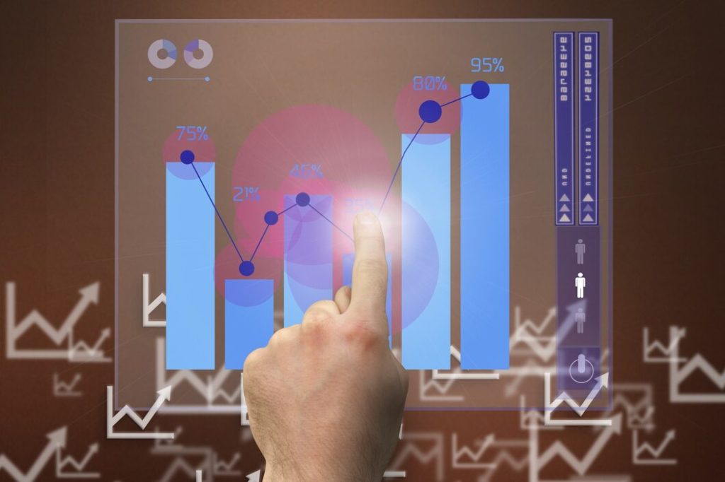
Financial data visualization serves as a bridge between raw data and actionable insights. By representing complex financial information in visual formats such as charts, graphs, and dashboards, organizations can uncover patterns, correlations, and outliers that may not be immediately apparent from raw data alone. Visualizations enable stakeholders to grasp key trends and relationships at a glance, facilitating faster and more informed decision-making.
Does Data Visualization Benefit Your Organization

Data visualization refers to the graphic data representation of your business that helps it deliver efficient results. Not only does it help to make better decisions, but it also gives viewers a better understanding of trends and patterns. With the help of visualization, organizations get a better idea of their financial tracking and management.
Well, the simple answer to this question is yes! Data visualization does benefit your business. These financial models help to add product lines, enter new markets, and remove old product lines. However, those implementing this model must realize how it can help and what are the best practices for it.
Key Principles of Financial Data Visualization
The methods used in financial data visualization represent the profit and loss of a company, its sales figures, and assets/liabilities. A few common tricks that help to track financial visualization are maps, diagrams, graphs, charts, etc. But, here I have listed down a few principles of it:
- Clarity and Simplicity: Keep visualizations clear, concise, and easy to understand. Avoid clutter and unnecessary complexity that can obscure the underlying message.
- Accuracy and Consistency: Ensure that visualizations accurately represent the underlying data and adhere to established standards and conventions. Consistent use of colors, labels, and scales enhances readability and comprehension.
- Relevance and Context: Tailor visualizations to the specific needs and objectives of the audience. Provide context and relevant annotations to help users interpret the data effectively.
- Interactivity and Exploration: Incorporate interactive elements such as tooltips, filters, and drill-down capabilities to enable users to explore data at different levels of granularity and gain deeper insights.
- Aesthetics and Design: Pay attention to the visual aesthetics and design of your charts and graphs. Choose appropriate chart types, colors, and fonts that enhance readability and visual appeal.
Tools and Techniques for Financial Data Visualization
Data visualization tools help to transform raw information into multiple and easily understandable formats. There are a lot of visualization software in the industry today that help organizations in a lot of ways. Are you curious to know more about visualization tools? So, check them out below:
- Excel and Spreadsheets: Excel remains a popular choice for basic financial data visualization due to its familiarity and ease of use. Users can create simple charts and graphs directly from spreadsheet data and customize them to suit their needs.
- Business Intelligence (BI) Tools: BI platforms such as Tableau, Power BI, and QlikView offer advanced capabilities for visualizing and analyzing financial data. These tools enable users to connect to multiple data sources, create interactive dashboards, and perform complex analytics without requiring extensive programming skills.
- Programming Languages: Python, R, and JavaScript are commonly used programming languages for financial data visualization. Libraries such as Matplotlib, Seaborn, ggplot2, and D3.js provide powerful capabilities for creating custom visualizations and implementing advanced statistical techniques.
- Data Visualization Libraries: Frameworks like Plotly, Highcharts, and Chart.js offer pre-built charting components and APIs for integrating interactive visualizations into web applications and dashboards.
Best Practices for Visualizing Financial Data
One of the best things about visualizing financial data is to keep the visuals simple. But is that all? There are a number of practices that can make it easier for your business to visualize economic data. Check them out here:
- Choose the Right Chart Types: Selecting the appropriate chart types based on the nature of the data and the insights you want to convey is essential. Line charts are ideal for tracking trends over time, while bar charts and pie charts are suitable for comparing categorical data.
- Use Multiple Axes: When visualizing multiple variables with different scales or units of measurement, consider using multiple axes to prevent distortion and improve readability.
- Embrace Interactive Features: Incorporate interactive features such as hover effects, zooming, and filtering to enhance user engagement and enable deeper exploration of the data.
- Utilize Annotations and Labels: Provide clear annotations and labels to highlight key data points, trends, and anomalies. Descriptive titles, axis labels, and legends help users understand the context and significance of the visualizations.
- Practice Data Storytelling: Structure your visualizations in a logical sequence that tells a compelling story and guides users through the key insights and findings. Use annotations, annotations, and narratives to provide context and explain the implications of the data.
Conclusion
Financial data visualization is a powerful tool for unlocking insights, identifying trends, and informing decision-making in the dynamic world of finance. By adhering to key principles, leveraging the right tools and techniques, and following best practices, professionals can create compelling visualizations that drive business value and empower stakeholders to make informed decisions.
As the volume and complexity of financial data continue to grow, mastering the art of data visualization will be essential for staying ahead in today’s competitive landscape. So, that’s all about it! Keep following us for more such content. Also, don’t forget to comment your thoughts below. Thank you for reading.
Read Also:
Share this article:


